Introduction
A collection of interesting photos and my comments on them. It was my (very short-lived) plan to try to post a new photo every day in 2021, but life (redundancy, pandemic, family) inevitably took over, so I have evolved this into an occasional series of some of my favourite recent photos. I am mainly doing this as a way of keeping up my output and to try to keep improving. I find that analysing a photo and writing about it is a great learning process for me, and if anyone else benefits from it as well, then even better. I have included some old photos as well and plan to occasionally add more of these.
4th Jan 2021 (New National Lockdown Day ... again)
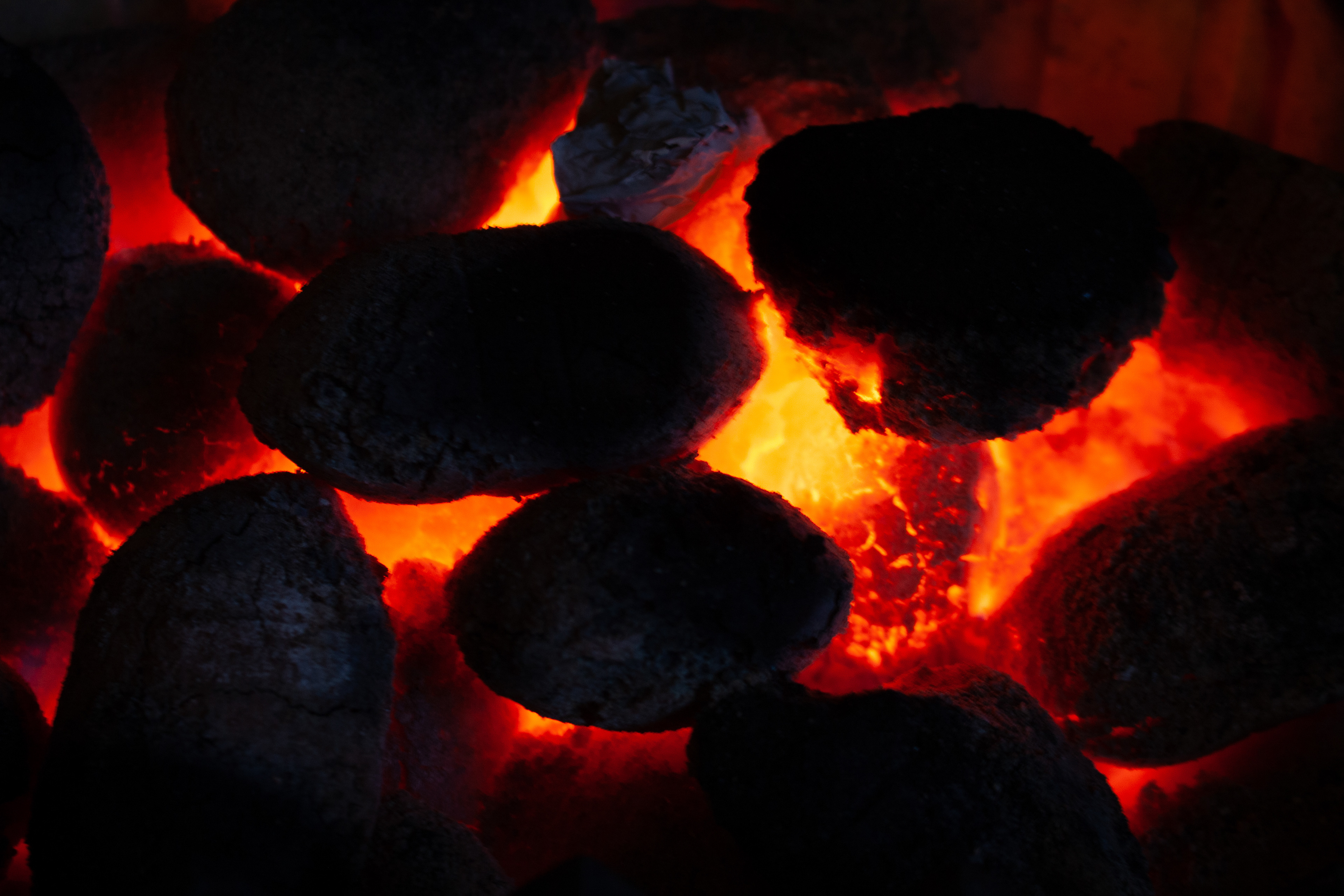
Original
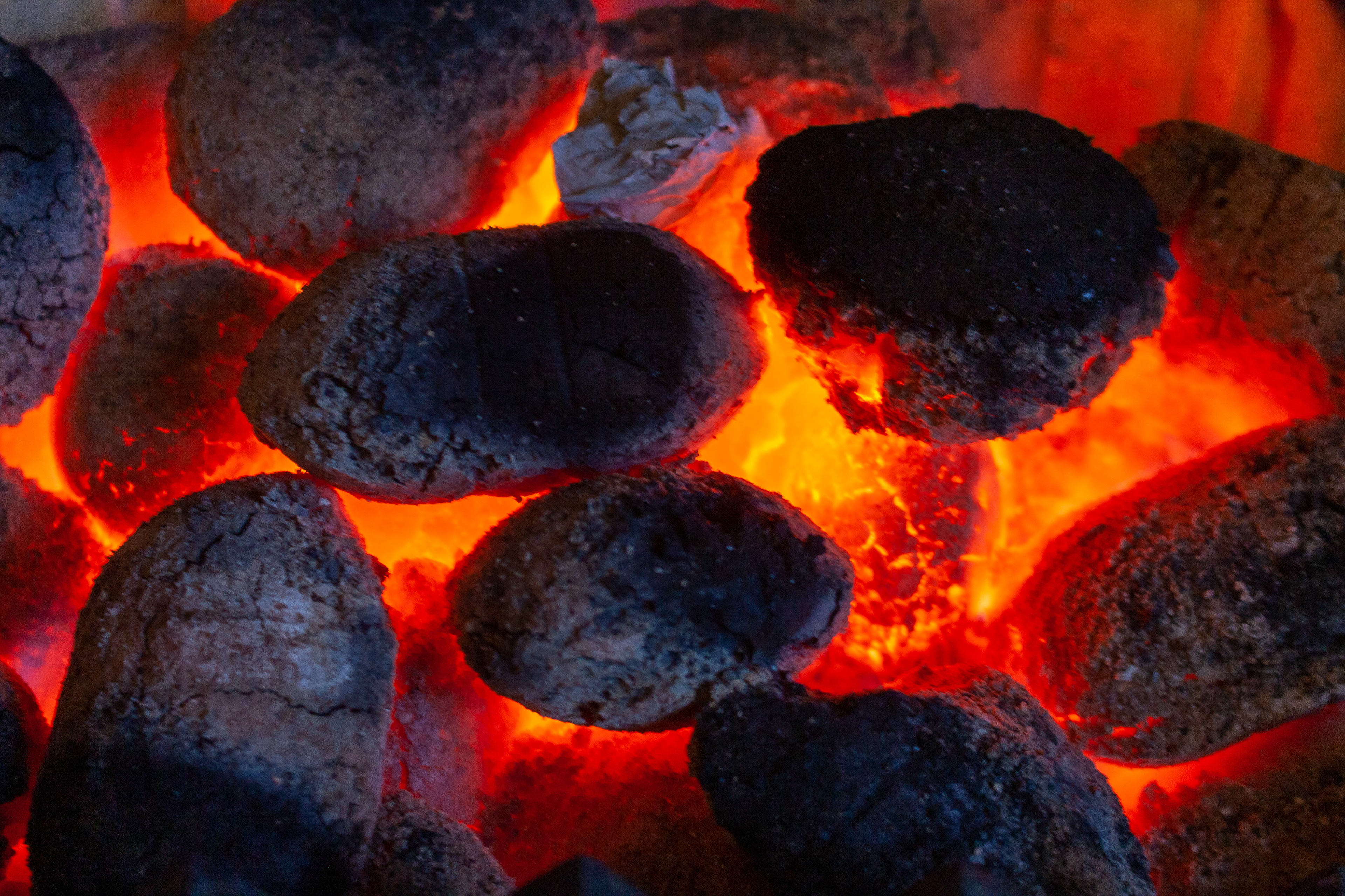
Processed
Another one I might have to have another go at. I definitely prefer the processed photo to the original and I'm wondering if I could have got the original photo closer to the final version. It may be beyond the dynamic range of my ancient camera as the contrast between the darkest and brightest parts of the scene are quite extreme. I need to increase the exposure to get more detail into the coal but my camera generates a lot of noise if I increase ISO much above the setting of 200 used here; the aperture was f/5.0 which I could have opened a bit more but would have lost the depth of field; and the shutter speed was 1/4 sec which is really pushing it hand held. So I either need to use a tripod and a longer exposure or do as I did this time and rely on Lightroom.
---------------------------------------------------------------------
2nd Jan 2021
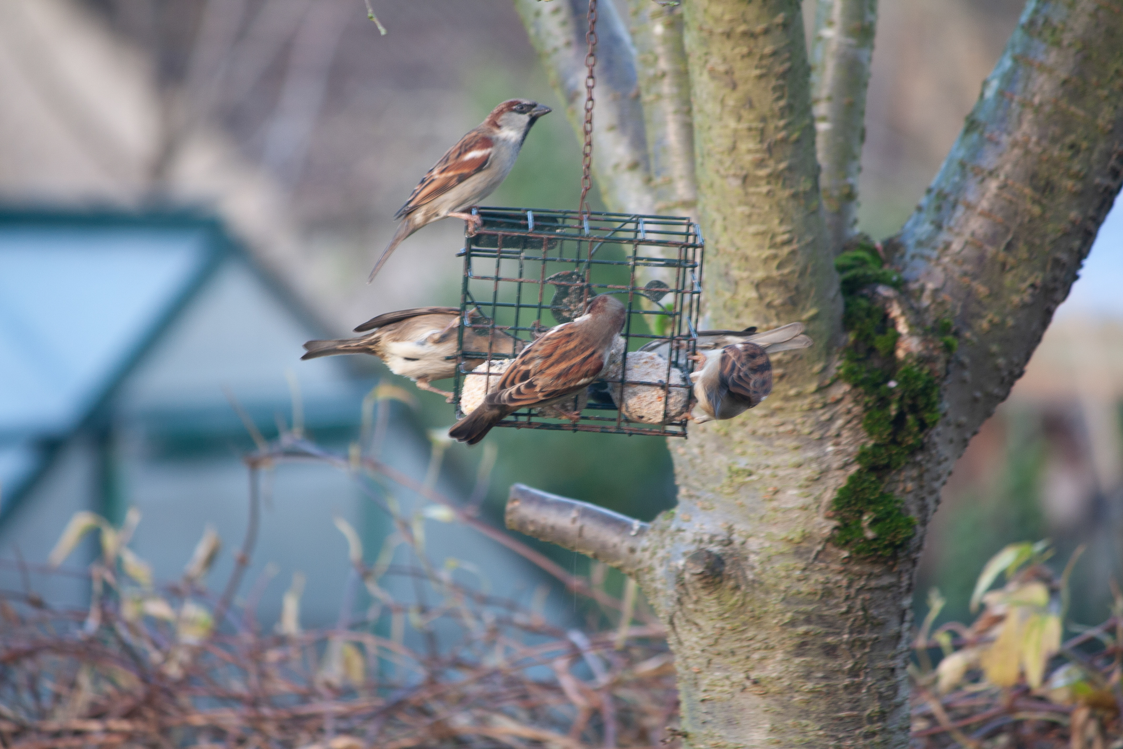
Original
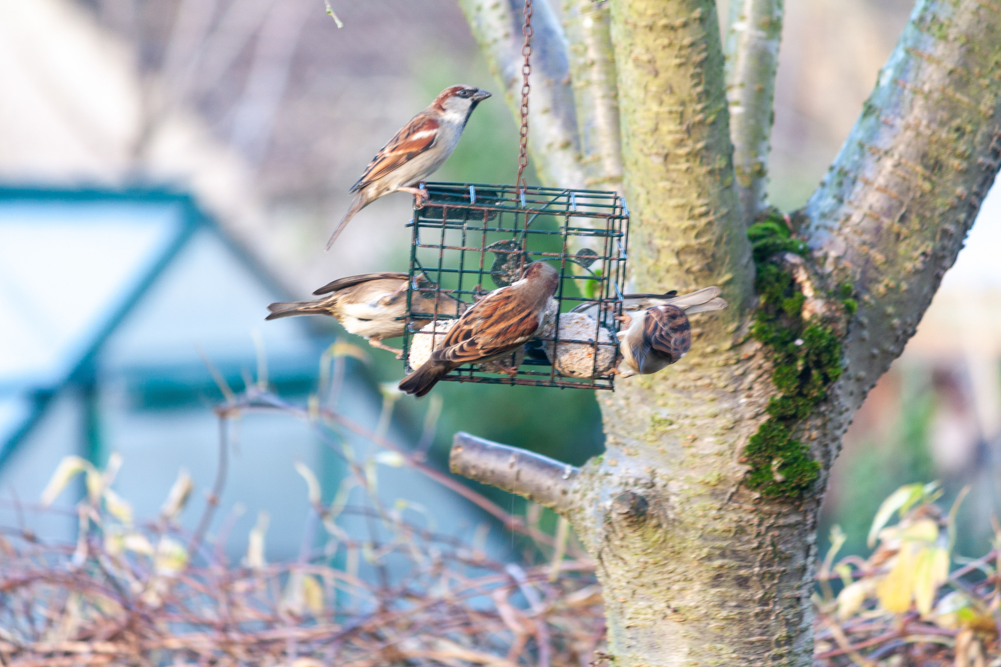
Processed
I think I've been overfeeding the birds in our garden and sometimes we now have 20-30 sparrows feeding at the same time. I tried to take something that showed the sheer number of them but settled on the one above. It's not a great composition (I needed to move a little to the right to get away from the tree) and the shutter speed was far too slow.
---------------------------------------------------------------------------------
1st Jan 2021, just!
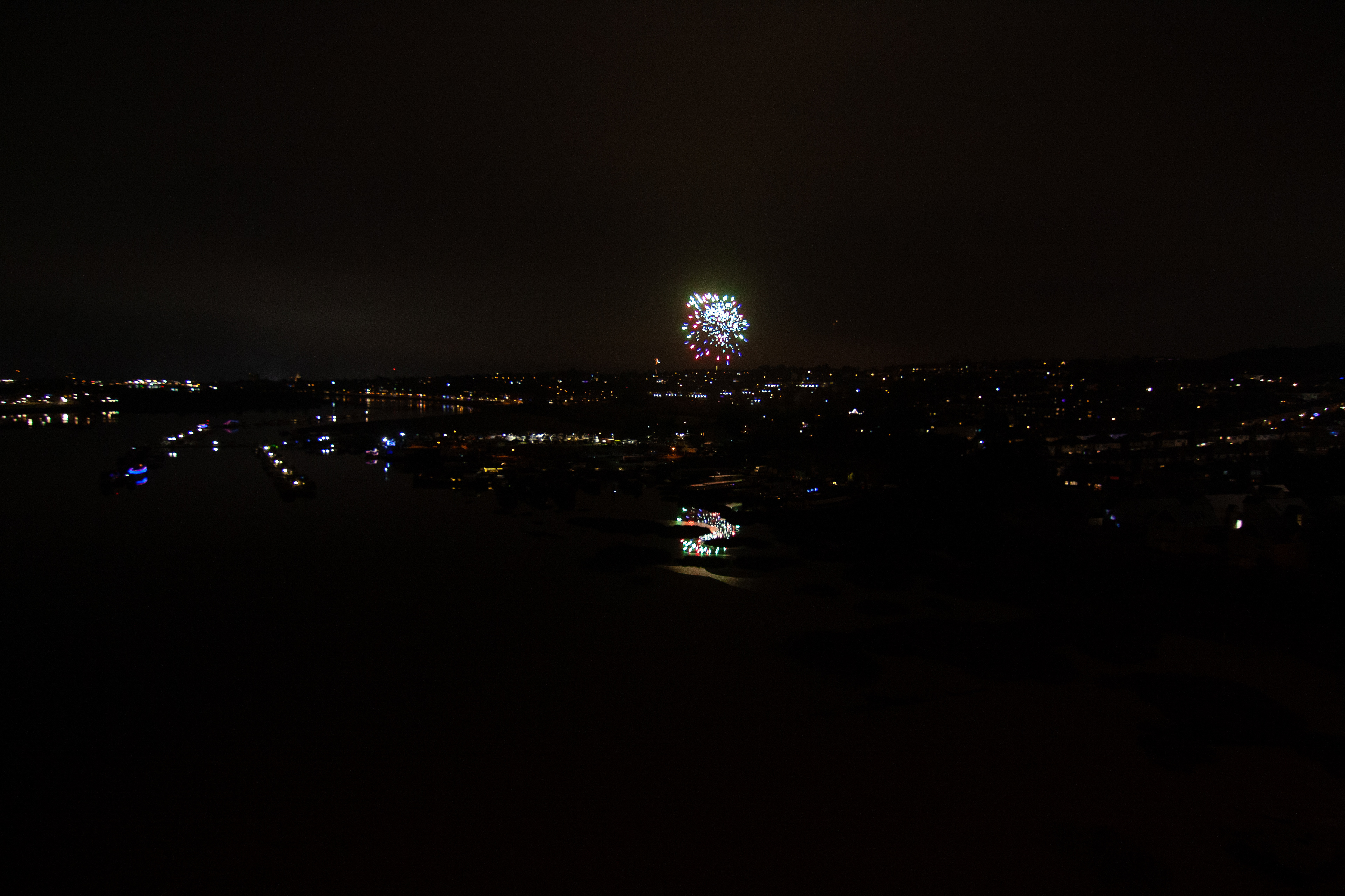
Original
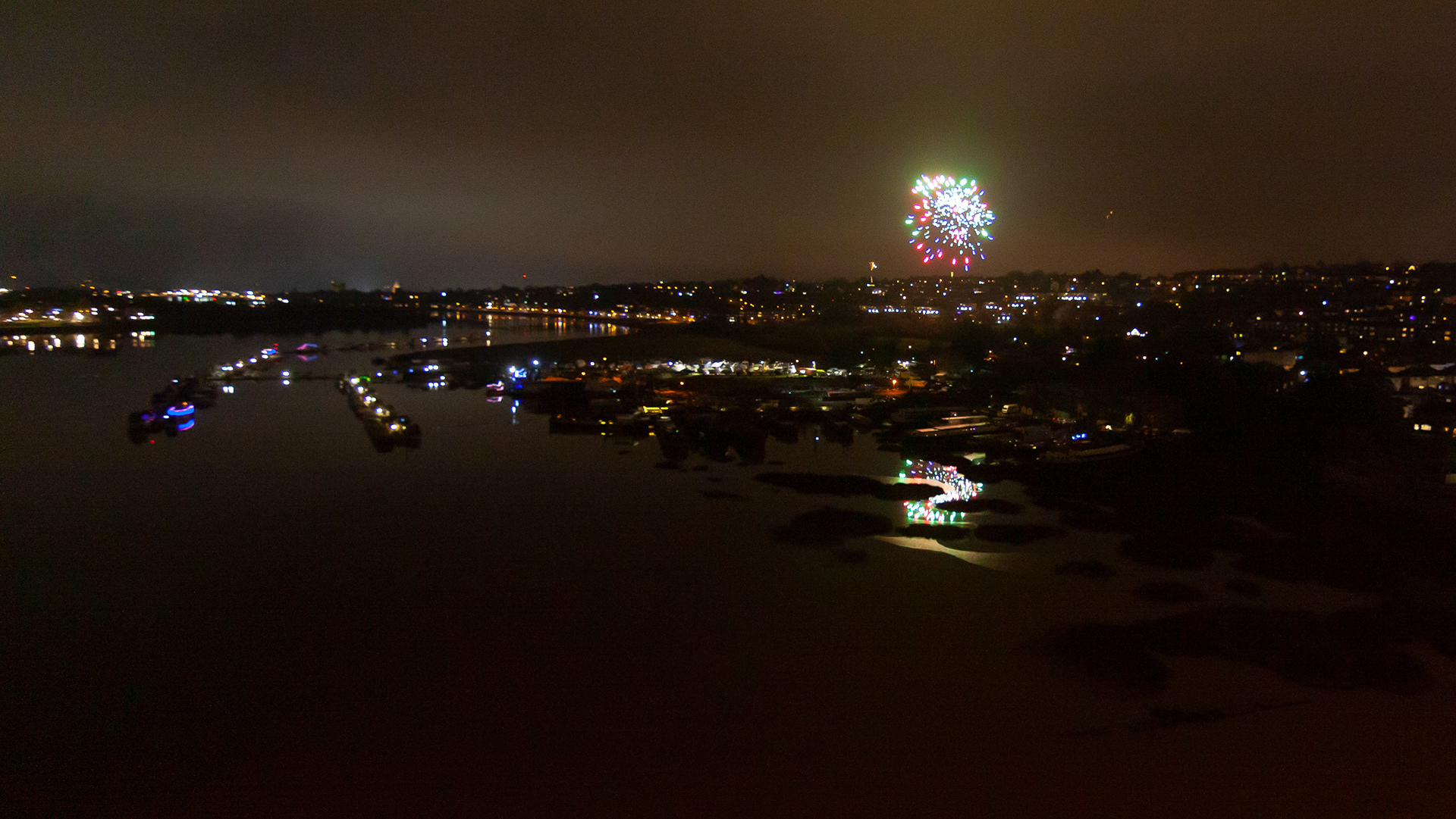
Processed
We decided to walk out onto the middle of the M2 bridge over the Medway to watch the New Year fireworks. I just took my wide angle lens thinking there would be lots more fireworks, but in hindsight I would have been better with a longer lens, especially as my other lenses are image-stabilised and there were not that many fireworks. The firework looks ok, but the background lights aren't sharp enough for me. Despite increasing the ISO and exposure time, the original photo was still too dark, so it needed quite a bit of processing to make it usable. What would I do differently next time? Use my 18-55 lens, pick an interesting background view, brace myself properly on the bridge fence and maybe use a longer exposure to get more of the firework movement.
----------------------------------------------------------------------------
June 2020
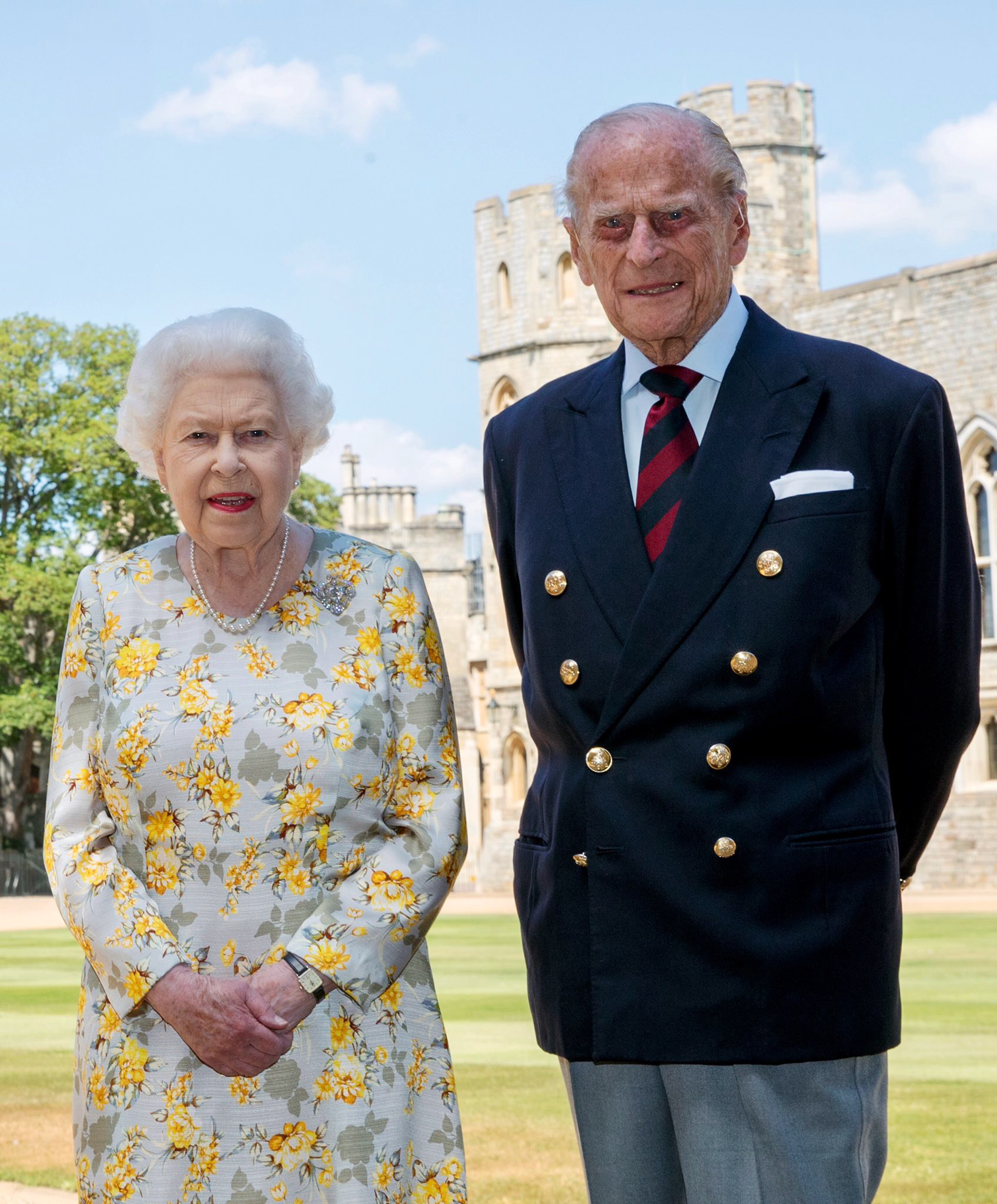
This was a bit of fun set by Andy Dixon to his 6th form students and members of the Kent College Photography Club. I think I went slightly over the top with my review!!
Even the quickest glance at this photo shouts that it has been "Photoshopped". The background is in bright sun, but they are not. Worse, there appear to be the classic black lines around parts of the Queen, especially her hands, which normally means that the original background has been removed. So let's look at it in more detail to try to see what might be real and what might be fake.
Without reading any of the other comments on this photo that have appeared in the media, a quick check showed that the photo was supposed to have been taken in the Quadrangle at Windsor Castle. Google Maps, Google Earth and other photos of the Castle confirmed that the background is the north west corner of the quadrangle taken from the opposite corner. With the bottom left hand corner of the photo suggesting that they are on the path and not the grass, and looking at perspective of the tree and tower, I reckon that the photo has been taken at around 90-100m from the tree. That's the easy bit.
What is more difficult is guessing how far the Queen and Prince Phillip are from the camera and whether the angles make sense. I have estimated that the tower behind the Prince is around 22m high (I did this by finding another photo of the same building with people standing in front of it and comparing their relative heights). I made a further estimation that the camera was at waist height (comparing them to the building in the background) at around 1 m off the ground. Without going into the maths, that would mean the camera would have to be about 3.5 m from the couple. That feels about right looking at the photo, so it is quite possible the whole photo was taken at this spot.
Now let's look at the light on the Prince. The building behind them is in bright sunlight, but they appear to be in shade. The background is arguably a little overexposed, or maybe it is just the bright sunshine. If this is a recent photo, even though the photo must have been taken in the morning as the sun is still shining on the east side of the tower behind Prince Phillip's head, the sun would probably be too high for the building behind the camera to be shading them. So, if we are to believe that they are standing on that spot, then some kind of shading must have been erected to keep the sun off them. If you look at the light and shadows on the Prince's jacket, it is quite even with small shadows under the creases. This looks quite believable and consistent with being shaded from the direct sun but still with a bright sky and lots of ambient light coming from all directions, especially the light coloured buildings. However, there is the suggestion of a catch light in his eyes so the photographer probably used a bit of flash, in which case, given all the ambient light (and over exposed background), you might have expected him to look a bit brighter. Also slightly suspicious is the Prince's jacket buttons. It's a shame the photo is not a higher resolution because then you might have seen more in the reflections. Nevertheless, if you zoom in on the buttons, there is the hint of many different shapes and colours reflected. This doesn't seem right given the building they should be standing in front of.
And now to Her Majesty. Starting with the good part, comparing this to other photos of them standing together, their relative heights look about right. But the rest of her just looks wrong. The most obvious thing is her hands. The black line around the bottom of the right hand usually means the background has been removed and replaced. In this case, it looks like the dress is correct but the hands have been pasted in from another photo. They even look slightly too big. Another clue is the watch. Zooming in on it shows that is 12 o'clock, but the photo could not have been taken at that time as the shadows would have looked different on the building behind them.
Her face and hair don't look quite right either. Regarding her hair, looking at it close up, some of it looks natural, but the very top of her head is clearly darker. This doesn't seem right given how bright the rest of the scene is. Also, I can't quite pinpoint what is wrong with the light on her face other than it doesn't look natural. Maybe she was lit badly, or over adjusted in post-production, or maybe she was standing somewhere else and has just been cut and pasted into this location.
In conclusion, the photo has definitely been modified. This it not necessarily a bad thing - official photos like this that are sent around the world and seen by millions of people are probably often tweaked to make them look as good as possible. However, this one has been done really badly just leaves you with questions such as how could they be so careless and amateur, or what were they trying to cover up?
----------------------------------------------------------------------------------------------
5th Oct 2018
Original
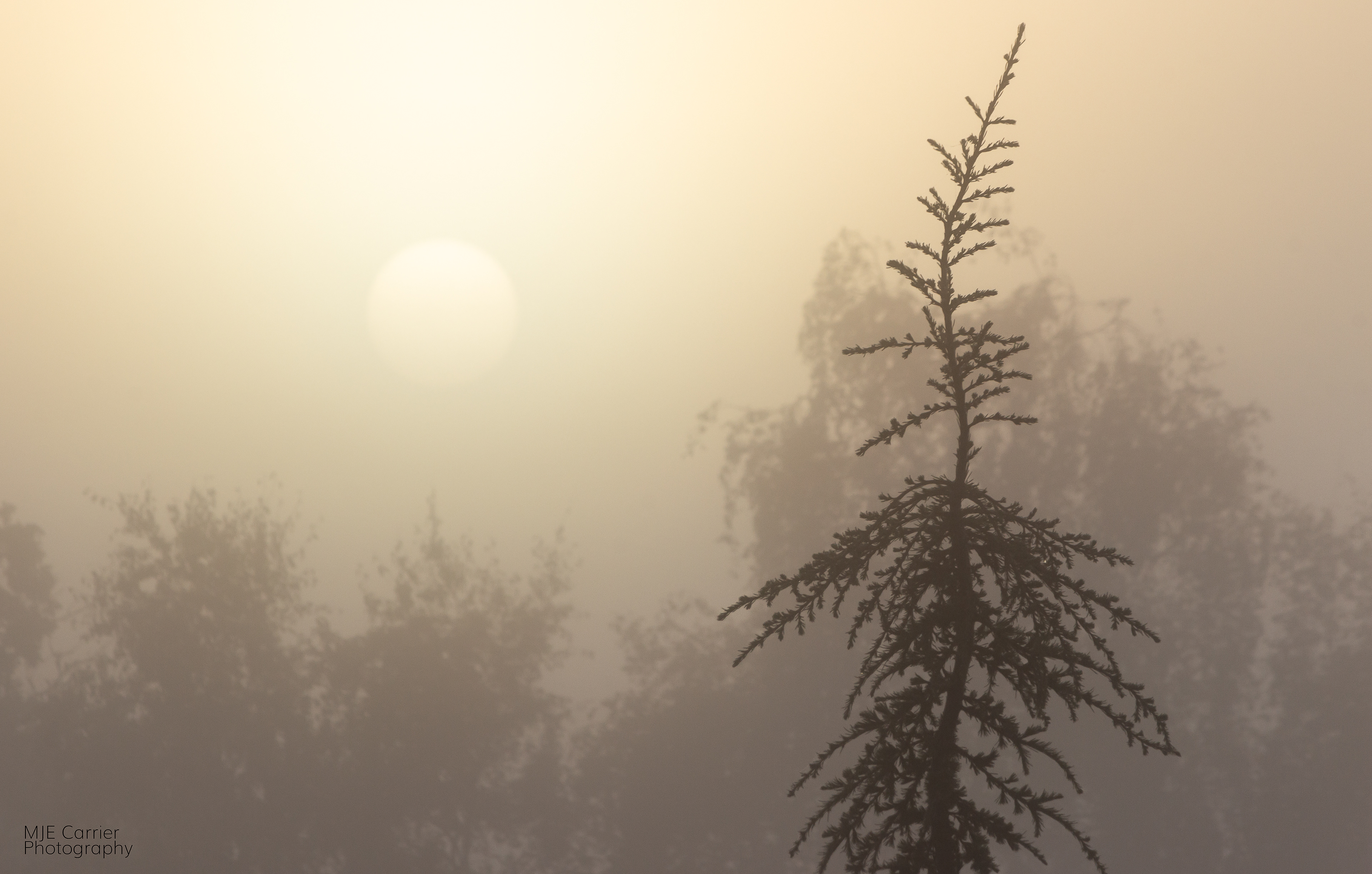
Processed
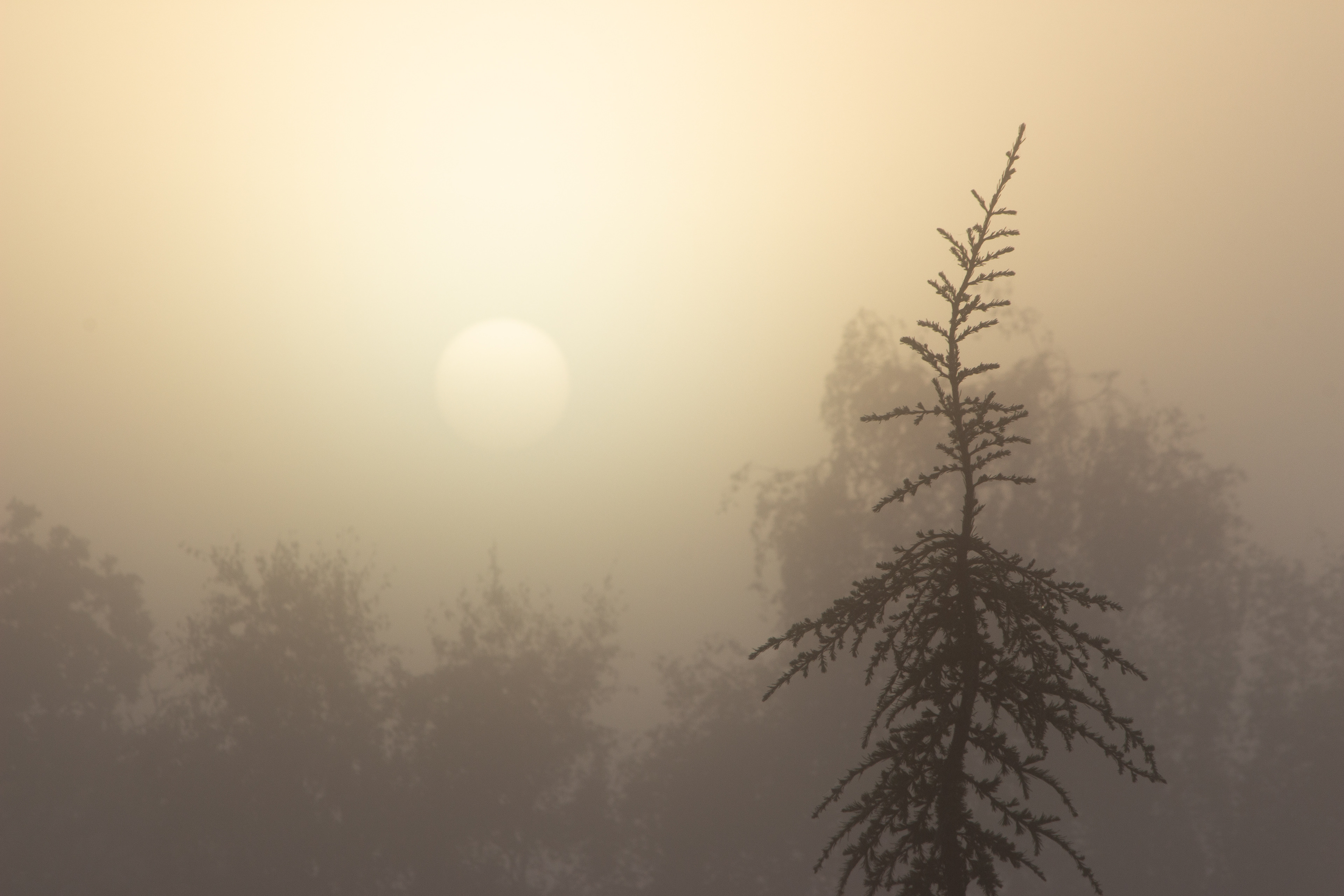
This is a long way from being a great photo, or even a ‘favourite’, but I have chosen it as my first Thought for the Week as it has highlighted a surprising number of points.
I was initially not very happy with the result, although my opinion has changed while writing this. One of my measures of success is whether it is good enough to print or add to the slideshow on my computer, and I'm not sure this quite makes the mark. I will describe below what I don't like and what I will try to do better next time, but, importantly, am I glad I stopped to take the photo? Very definitely Yes. On a technical level, how am I going to get better if I don't keep trying and properly reviewing my work. But on another level, looking beyond just the photography aspect, if I had not stopped to take this photo I wouldn’t have spent a couple of minutes simply enjoying a beautiful view. Almost certainly I would have forgotten it by now.
I think I had a vision of what I wanted to capture, and you can see most of it in the photo. The mist was so thick that you could safely look at the sun, yet it was still clearly defined. And I liked the single nearby tree and the distant trees that were disappearing into the mist. I was at the top of some steps outside my office so had little room to manoeuvre, but no matter, I could position the sun and the single tree roughly on the vertical thirds. So far so good.
But, here are two major learning points. First, there is, arguably, a problem with the focusing. And second, this problem was not immediately obvious when reviewing the photos on the back of the camera.
I'm changing my mind on this as I write, but my initial thought was that it's a shame that I didn't get both the foreground tree and the background trees in focus. I usually wear a landscape photographer's hat and want the whole scene to be in focus (and dream about being able to afford a higher resolution camera to get even more detail), so my first reaction was that even shooting at f/16 I didn't manage this. But looking at it again a couple of days later, I'm not so sure. Maybe it looks better like this with the background trees slightly out of focus to emphasise the heavy mist. What do you think?
Coming back to my first thought, what did I need to do to get both in focus? A simple check on a depth-of-field calculator would have shown with my lens at 250mm, even at its minimum aperture of f/32, what I wanted to do was impossible. My camera has a crop factor of 1.6, so with my focal length at 250mm and the first tree about 25m away, my DOF was only 6m, nowhere near enough to include the background trees which were about 120m away. Focusing on the background trees would have given me nearly 200m DOF but only starting at 77m, too far away for the first tree. The closest I could have got was shooting at f/32 and trying to focus at around 45m. This would have given me a DOF from about 32m to 80m - neither the foreground or background would have been in sharp focus, but it might have been close enough.
Of course(?), at f/32, ISO 100 and the early morning light, my shutter speed would have been around 1/8 sec which is too slow to be handheld anyway, so I would have needed to get my tripod out of the boot of my car. So it turns out that I have actually taken something that was as about as good as I could have achieved in the circumstances.
Alternatively, I could have changed to a shorter focal length, say 100m, then at f/16 and a focus point of 35m I would have had a depth of field from 17m to infinity. But then I would have had to crop out a substantial part of the frame in post-processing and probably lost some of the detail I was trying to achieve. Who said photography was easy?
By the way, if anyone is reading this and hasn't got a clue what I'm talking about, don't worry I want to add lessons on this and other photography basics in future weeks.
My second point was what the photo looked like on the back of the camera. It actually looked really good and just what I was aiming for. As it turns out, there wasn't much I could have done about it, but I need to remember to zoom in on an area to check on the focusing if that is a critical part of what I'm trying to take.
Another point is that this is a great example of how, sometimes, you have very little time to get the shot. When I arrived at work, the view was even better with a couple of thin wisps of cloud crossing the sun. I think this was what persuaded me to come back up from my office with my camera. However by then, the cloud had gone but it was still worth capturing. And about three or four minutes later, the sun was too bright.
In conclusion, I think this has been a great start to the series. I have ended up with an ok photo and a better understanding of depth-of-field, and hopefully it is has been an informative read for everyone else. Again, please let me know what you think.
----------------------------------------------------------------------------------